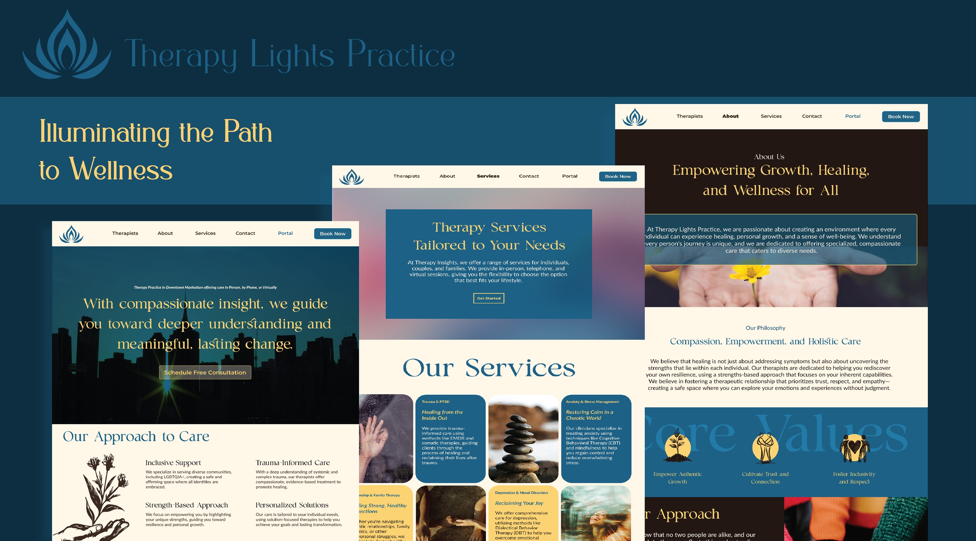
Therapy Lights Practice
Therapy Lights is a website redesign for a private therapy practice. The project focused on creating a modern, accessible platform that clearly communicates services, builds trust, and makes it easier for clients to seek support.
UX Case Study · Website Redesign · Client Project
OVERVIEW
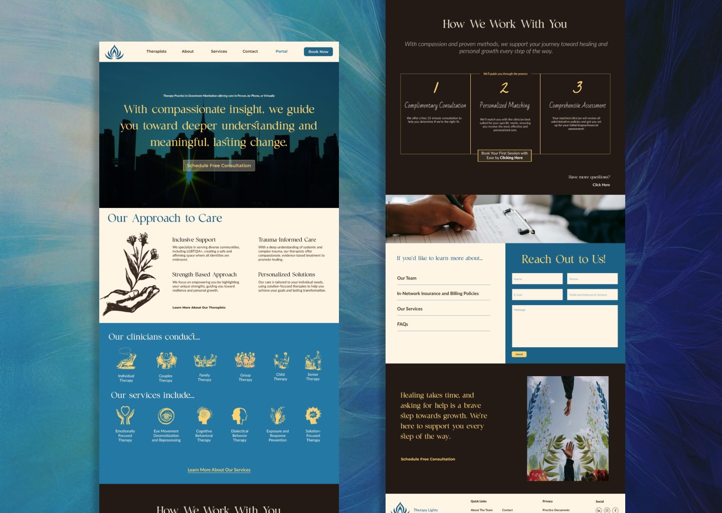
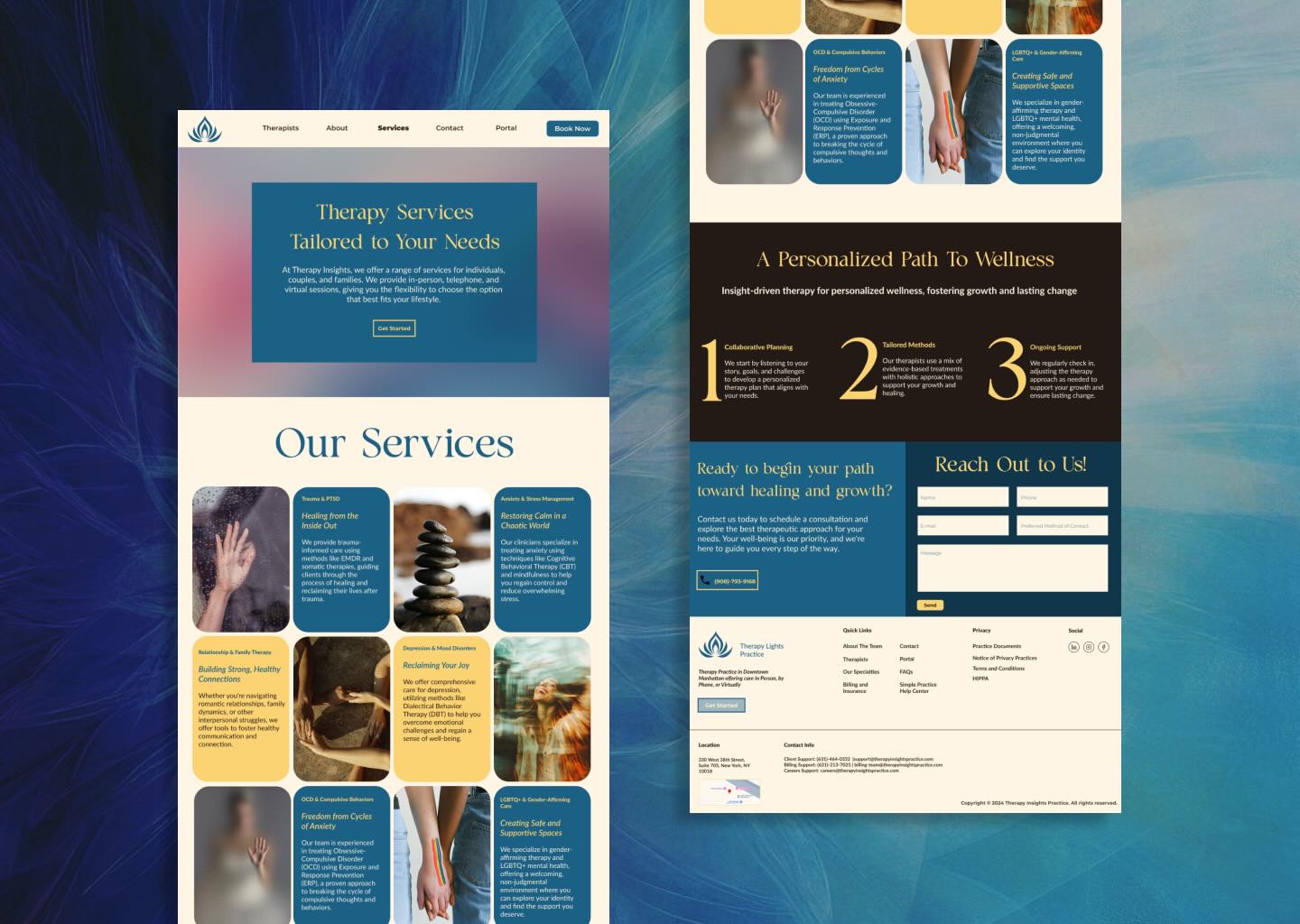
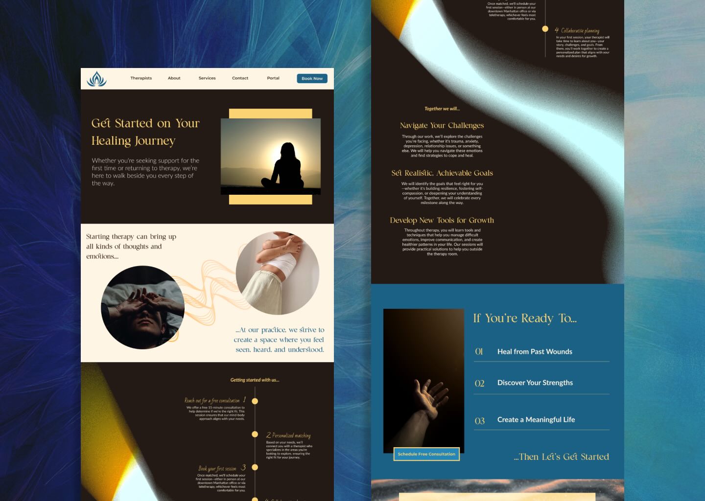
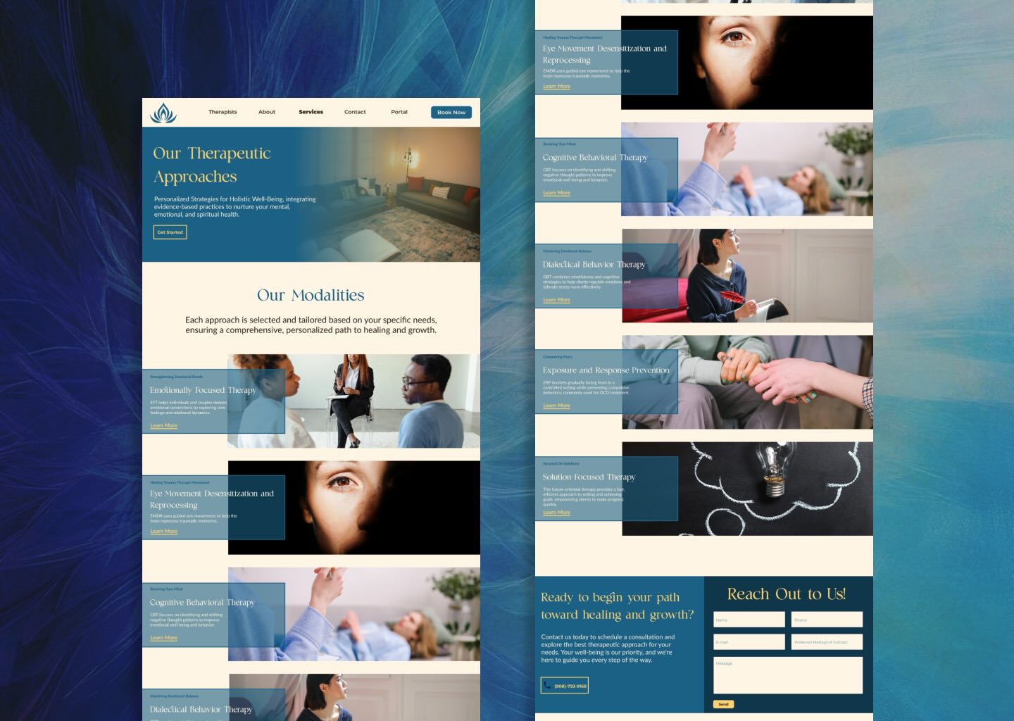
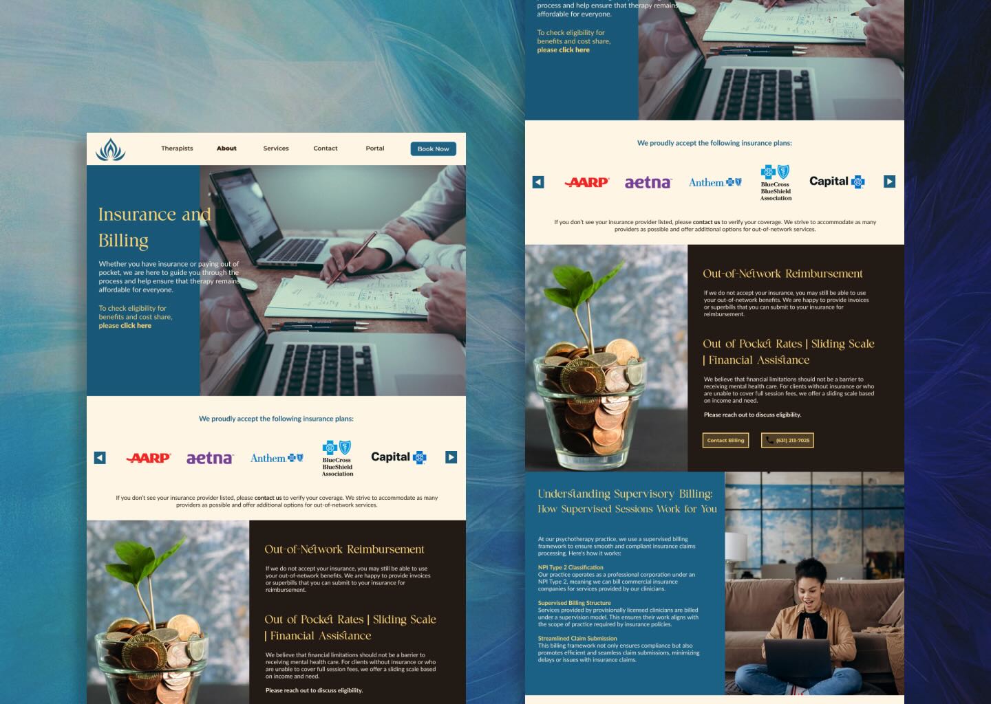
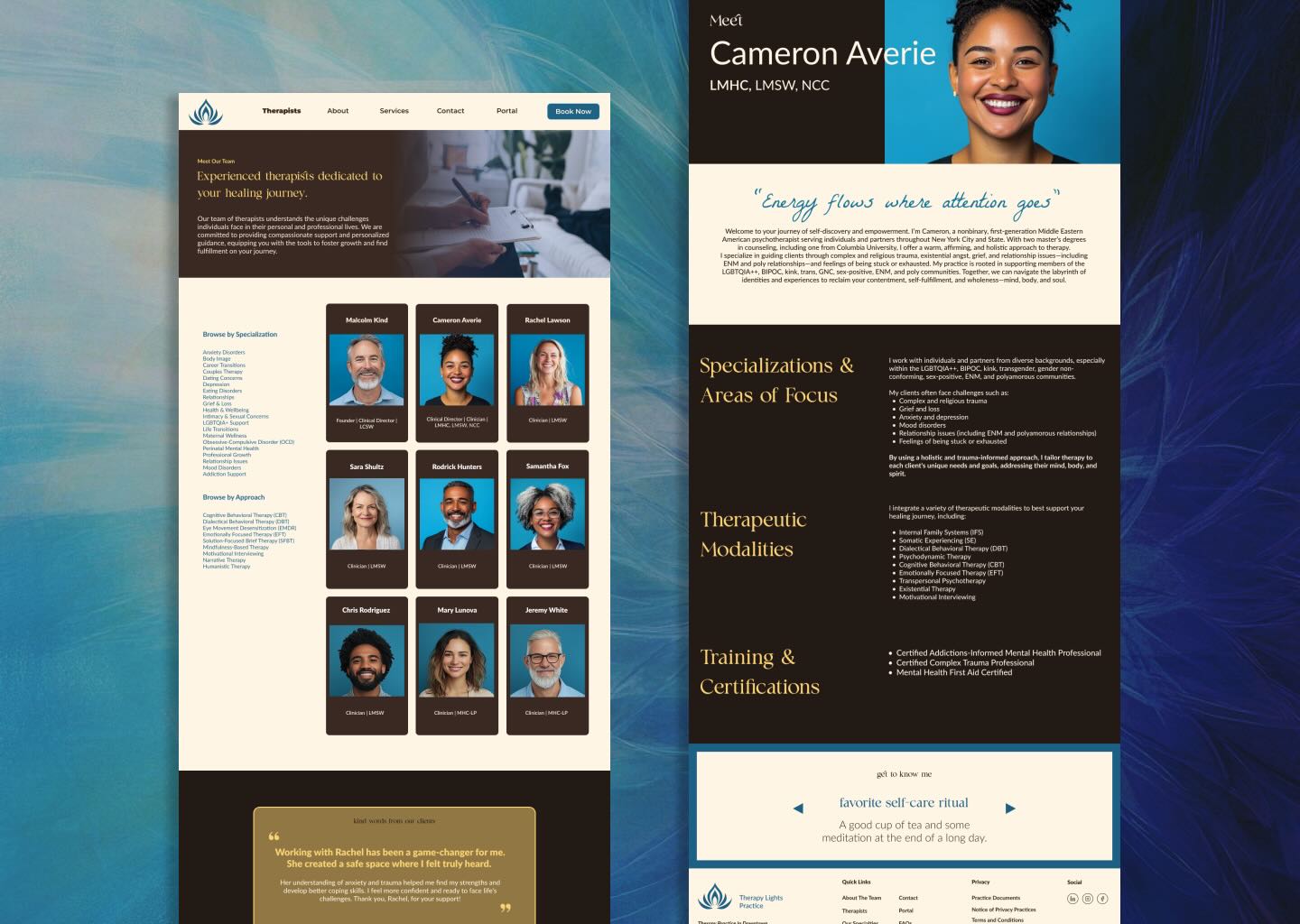
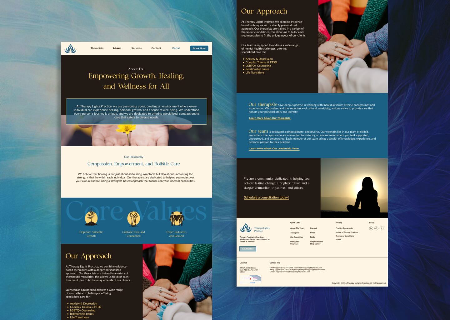
Therapy Lights is a private therapy practice that needed a digital presence reflecting both professionalism and compassion. Their existing site was outdated, difficult to navigate, and lacked clarity around their services. The challenge was to redesign the website to make it approachable, user-friendly, and informative while building trust with potential clients.
- Conducted stakeholder interviews to understand practice goals and client needs
- Performed content audit of the existing site
- Created wireframes and site maps to restructure navigation
- Designed a modern, calming visual identity aligned with therapeutic values
- Built a responsive layout emphasizing services, resources, and contact pathways
APPROACH

No items found.
KEY FEATURES/ HIGHLIGHTS
No items found.
OUTCOME
The redesigned website provided Therapy Lights with a modern, professional, and welcoming digital identity. The clear navigation and approachable content structure made it easier for clients to find services and reach out. By addressing both emotional reassurance and practical usability, the design supported the practice’s mission of making therapy more accessible.
- Improved clarity of services and booking options
- Strengthened brand trust with a design that communicates warmth and professionalism
- Positioned the practice competitively in a crowded wellness market
- Created a foundation for growth, with a scalable design adaptable to future offerings
REFLECTIONS
This project highlighted the importance of designing for trust in sensitive industries like mental health. It reinforced how typography, color, and layout choices can influence comfort and confidence for potential clients. More than just a visual update, the redesign became a tool for accessibility, connection, and client outreach.