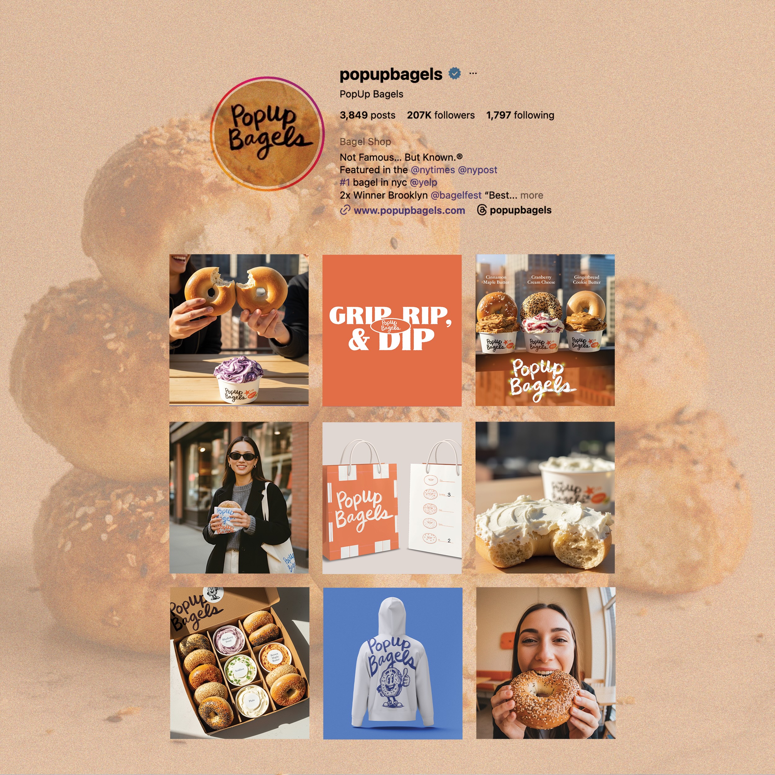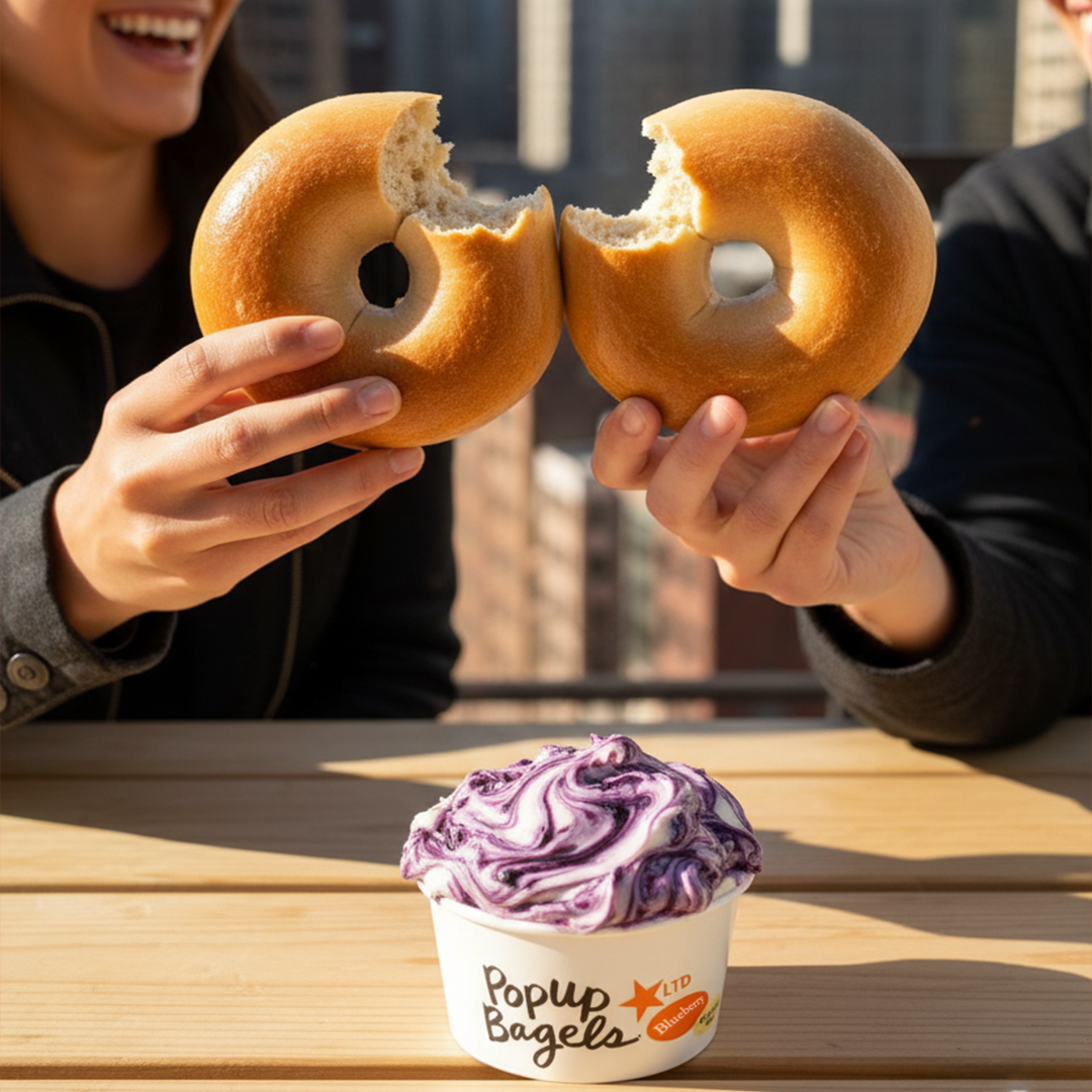
PopUp Bagels is a fast-growing, culture-forward food brand known for its bold personality, community-driven spirit, and distinctive product experience. This concept project explores how the brand’s visual world can evolve across key touch-points, from packaging and merch to photography and store graphics, while preserving the energy and authenticity that make PopUp so beloved.
The goal of this exploration was to create a more cohesive, elevated visual system that strengthens brand recognition, enhances storytelling, and supports the brand’s continued growth.
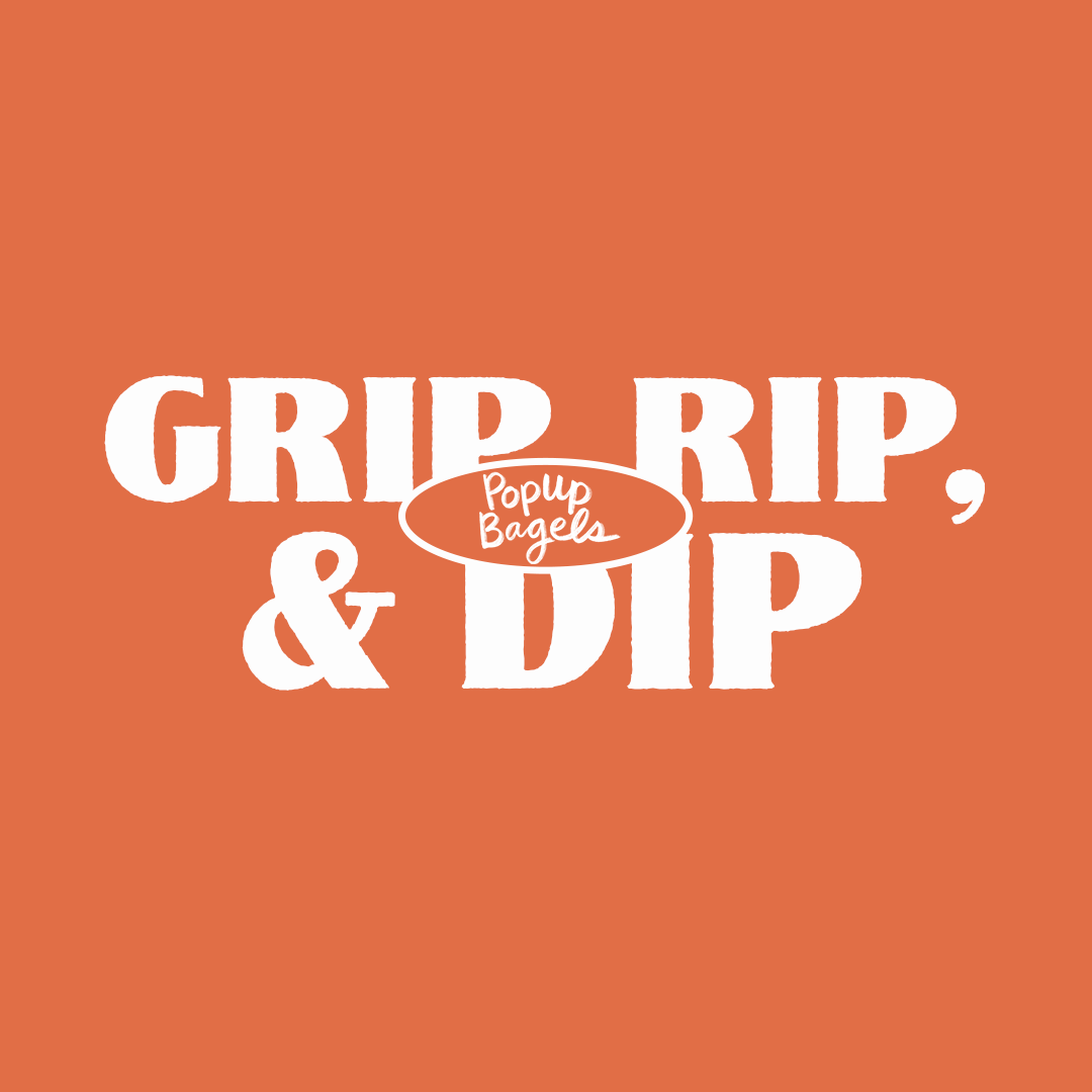
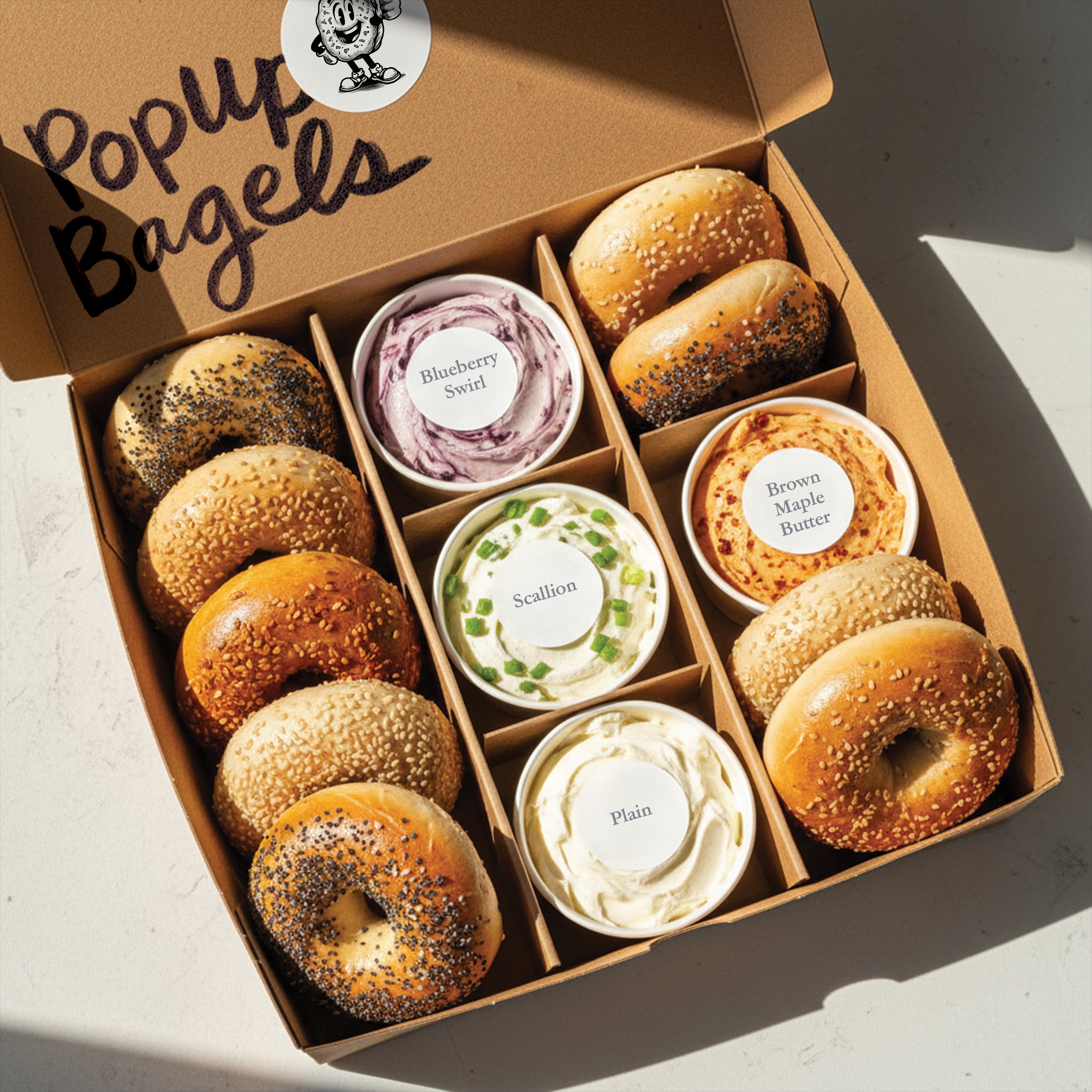
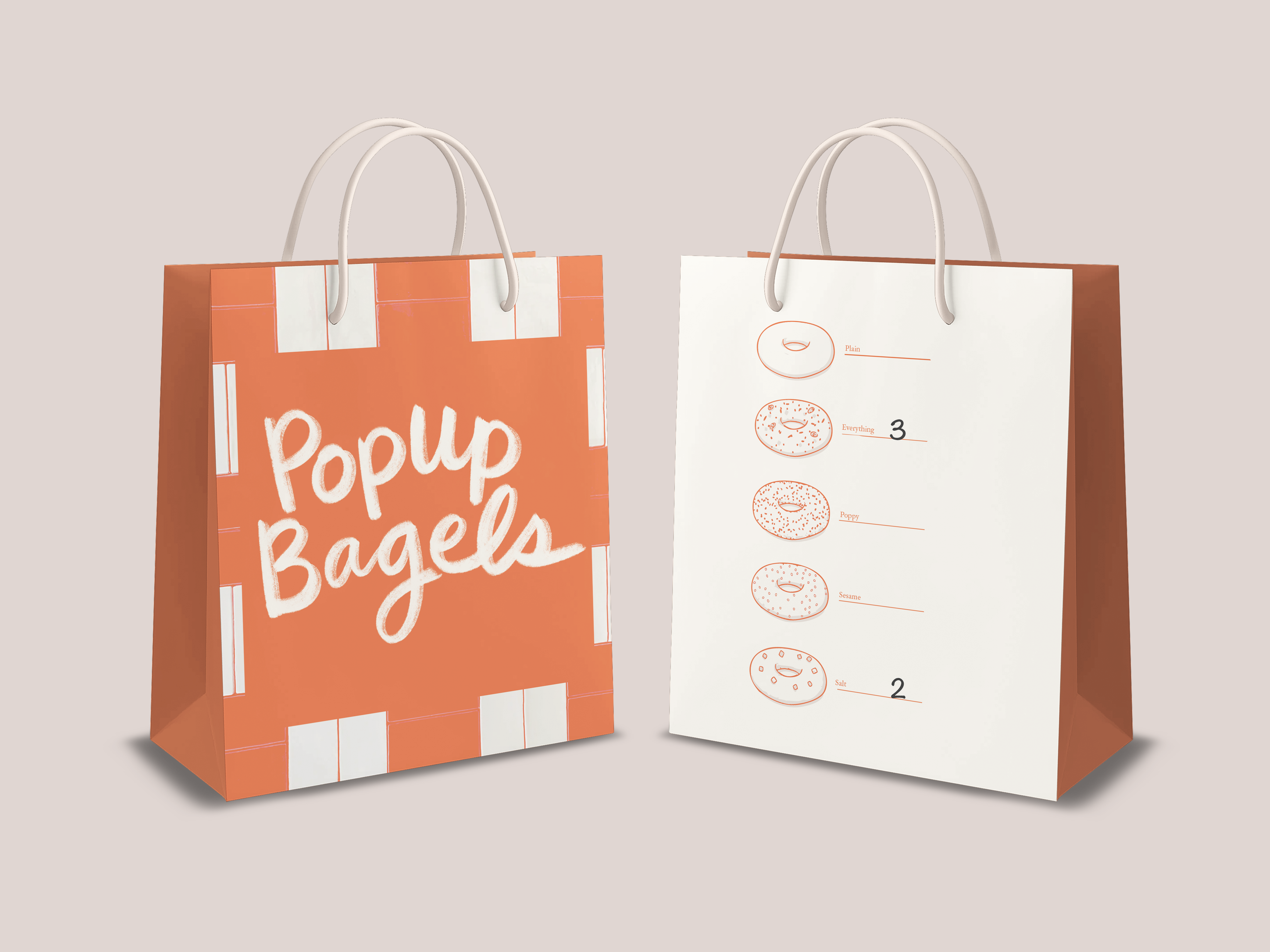
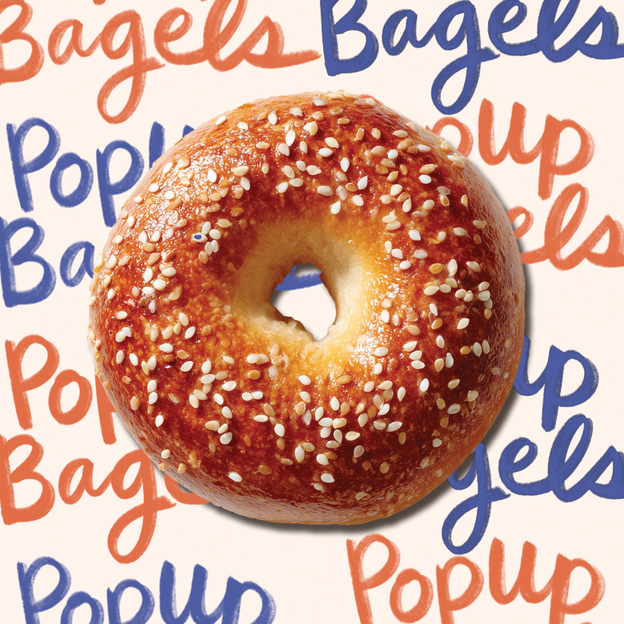
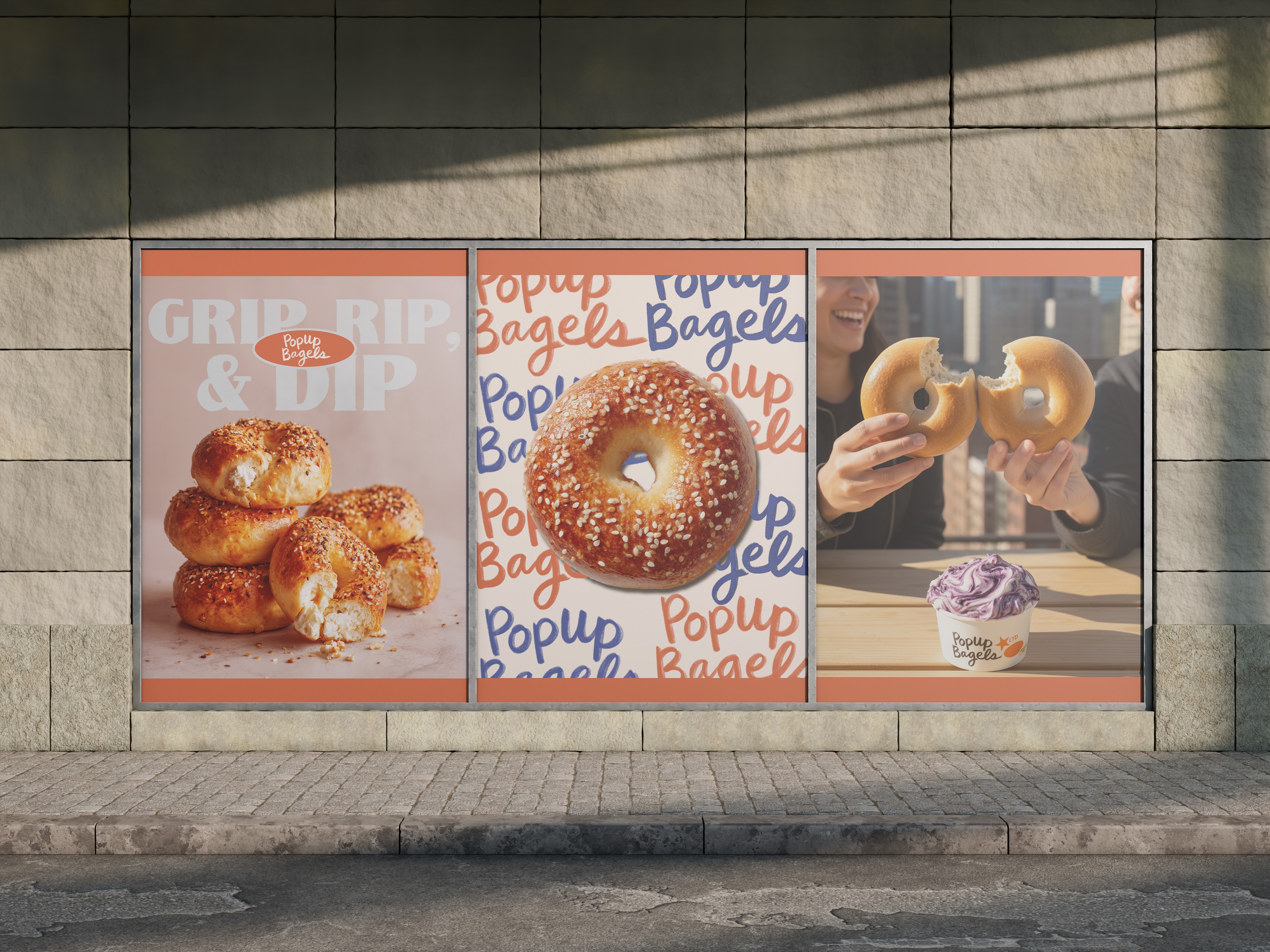
I approached this project by studying PopUp Bagels’ existing visual DNA, including its playful tone, minimal layouts, bold typography, and community-first attitude, and then building a system that enhances these strengths while addressing areas of inconsistency.
My focus was on:
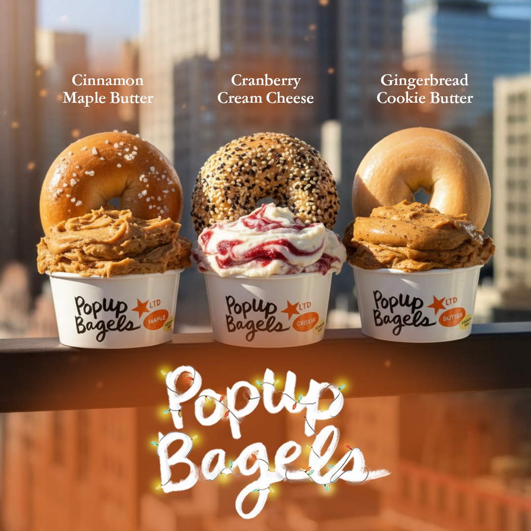
- Bringing cohesion to packaging, merch, and environmental graphics
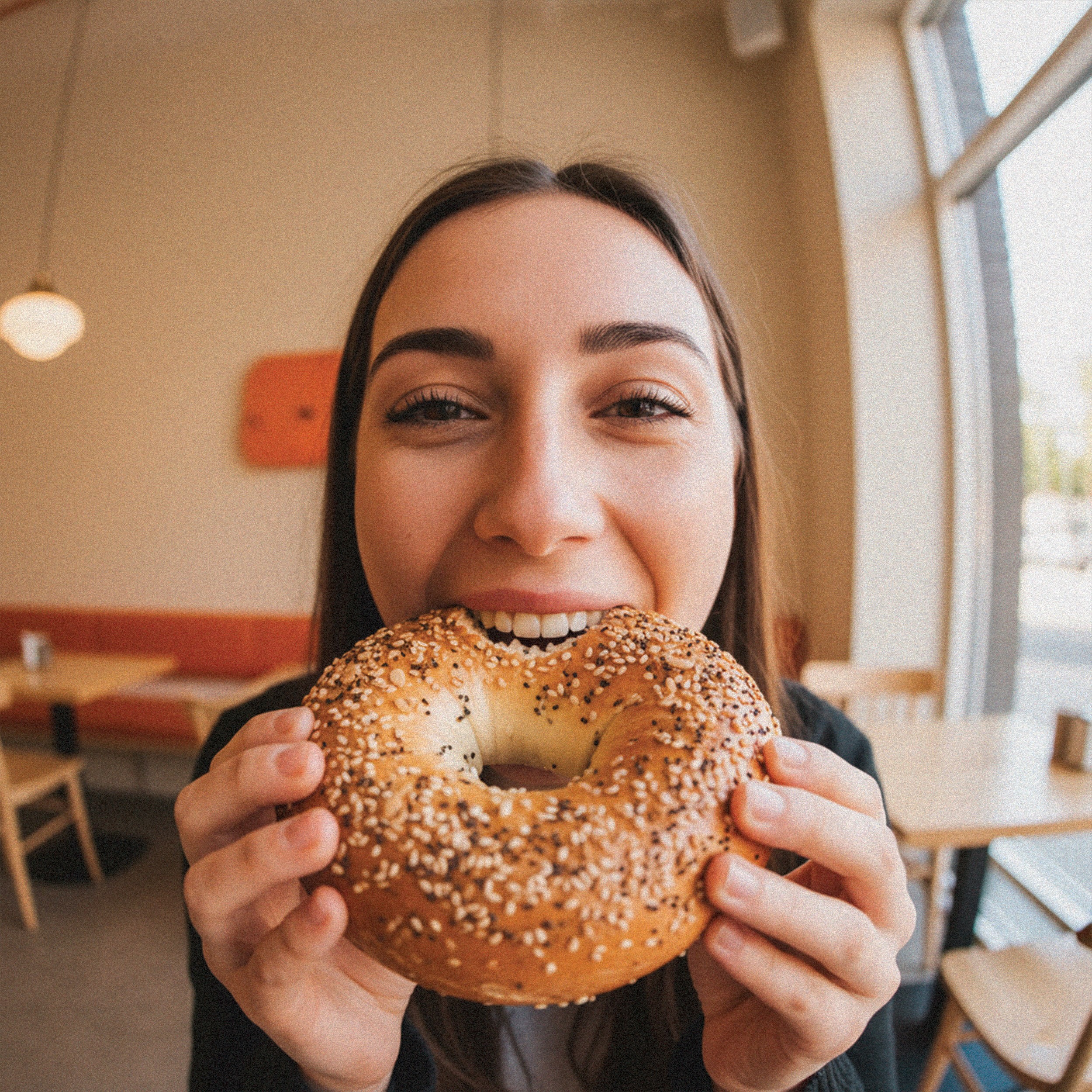
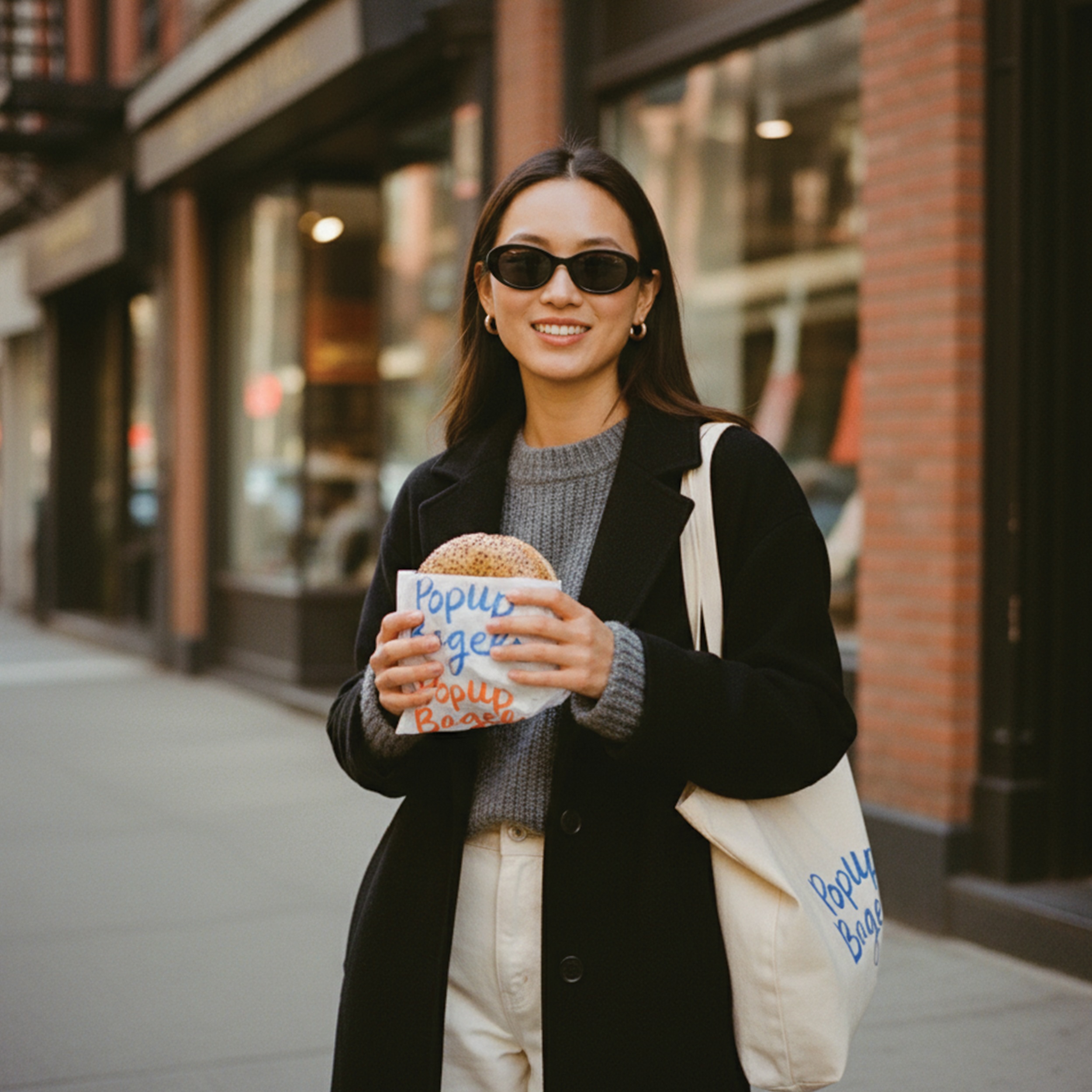
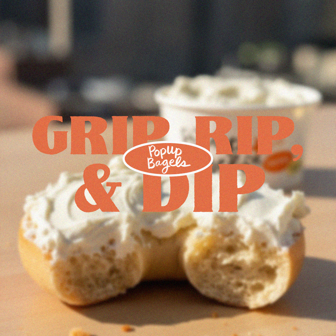
- Creating a photography style that feels candid, appetizing, and on-brand
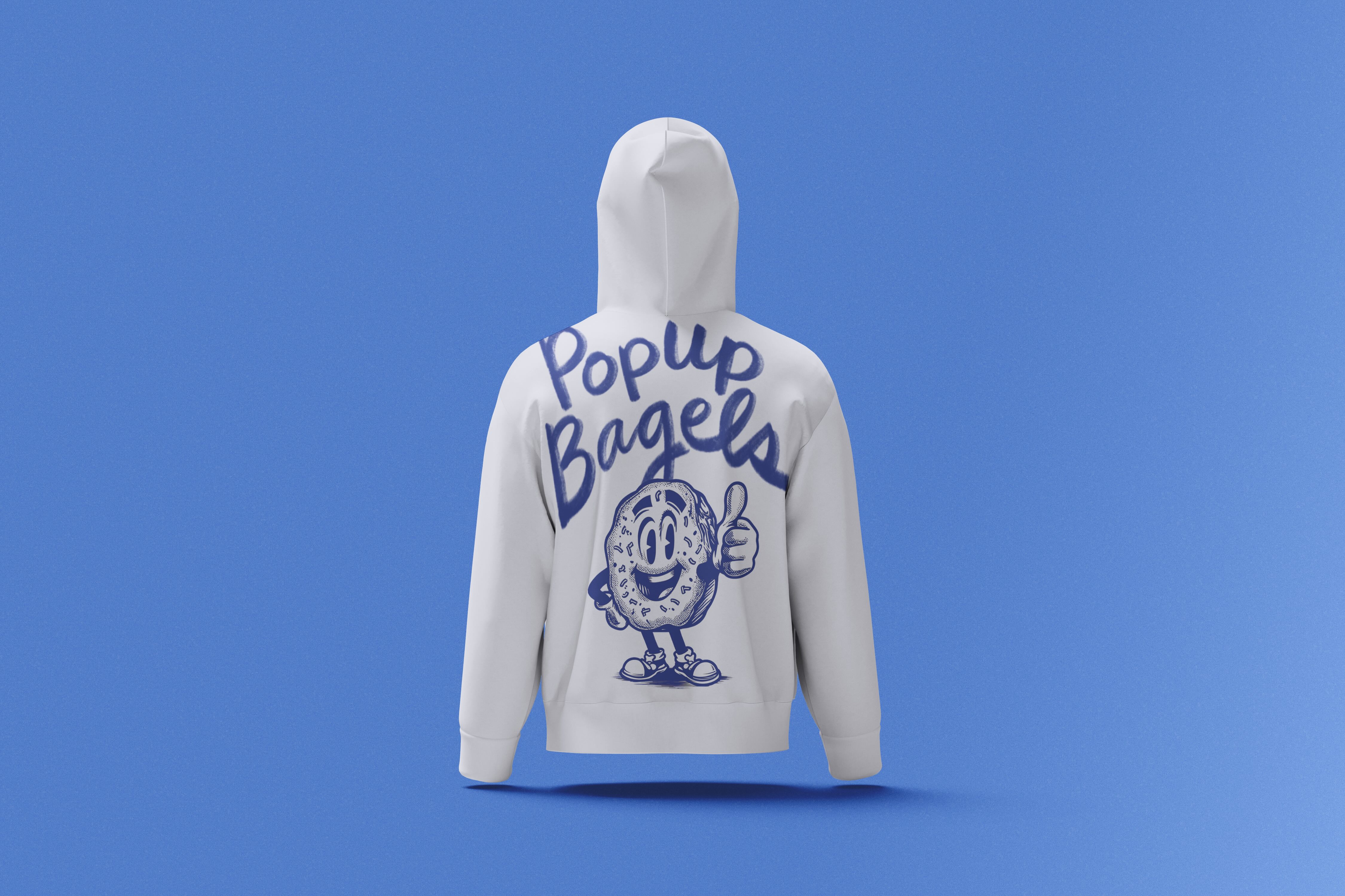
- Elevating merch and seasonal drops through clear design systems
- Refining visual motifs like crumbs, bagels, and bold type to create a recognizable identity
- Maintaining the brand’s cultural edge while introducing clarity, structure, and polish
The result is a concept direction that feels unmistakably PopUp, bold, fun, and community-driven, but more unified and ready for scale.